Challenge
Rework and reinvigorate a brand that has become sterilized over the years. The logo mark is recognizable and has clout in the Atlanta area, but had been paired with boring fonts and safe colors. How can we create a visual brand that is more aligned with the agency’s personality while maintaining what already has clout in the Atlanta area.
Outcome
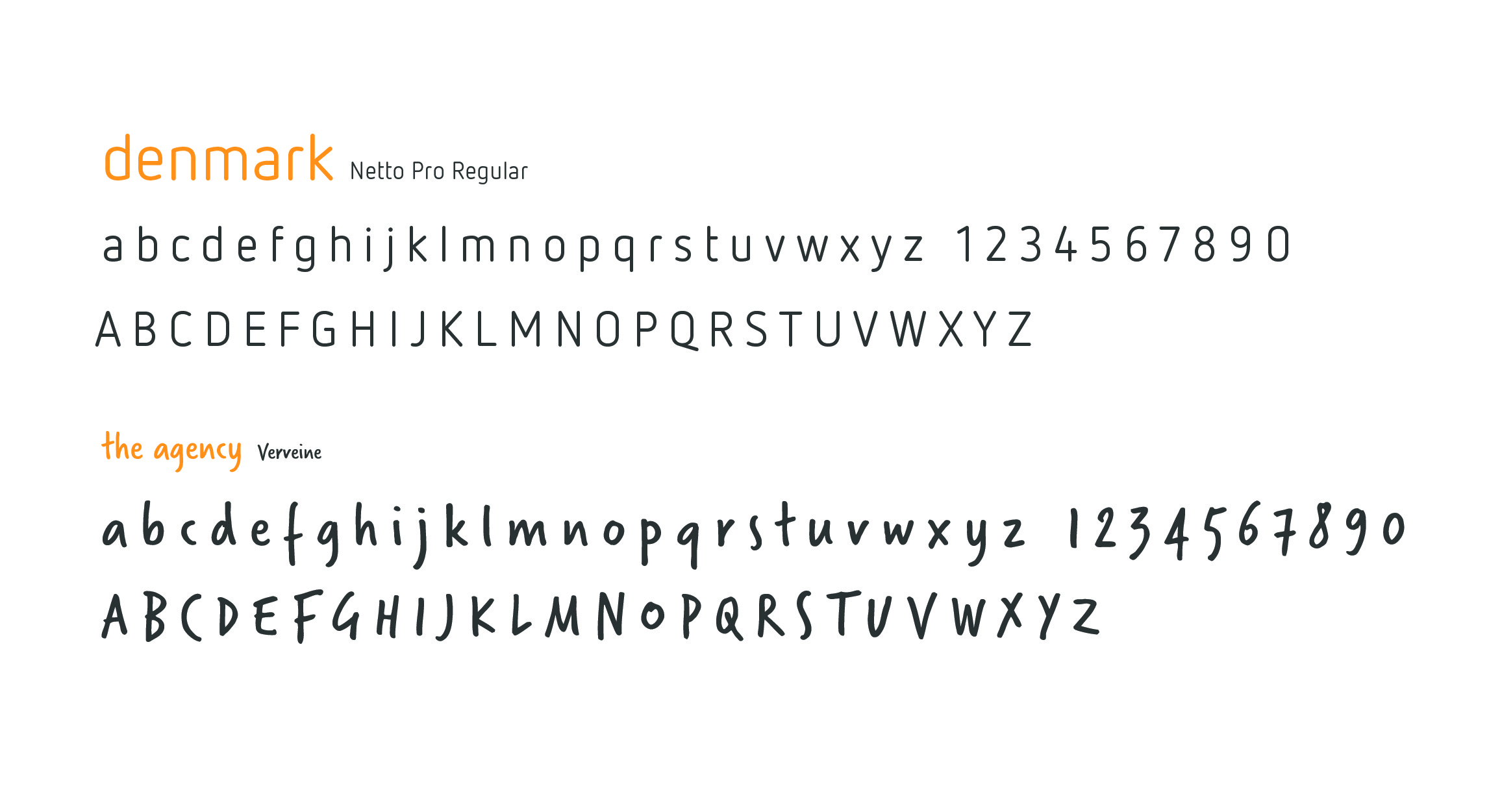
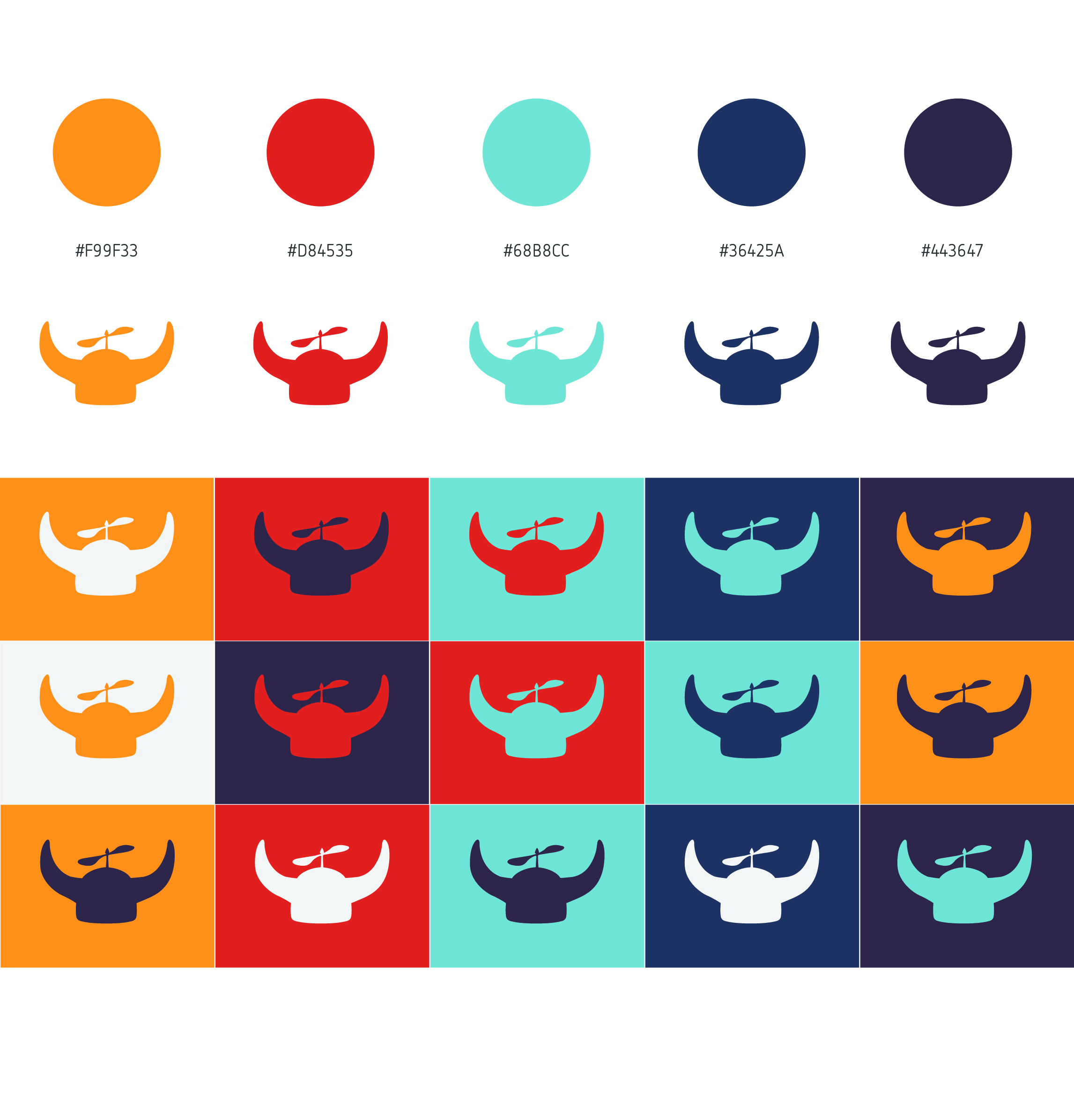
By pairing the logo mark with more interesting type and positioning the helmet in a more interesting position in relation to the type, we created a logo with more personality and interest. Bright, fun colors allow us more options for creating fun, bright designs that will stand out from other agencies.