Fantasy Sports is still a relative new comer to mobile gaming, and we found that there is still a lot of room for improvement. Current competitors tend to have more busy and complex layouts. This can be overwhelming. We wanted to find a way to simplify so that such a large amount of information could be easily read and understood.
Competitive Analysis

The Rivalry Sports Experience
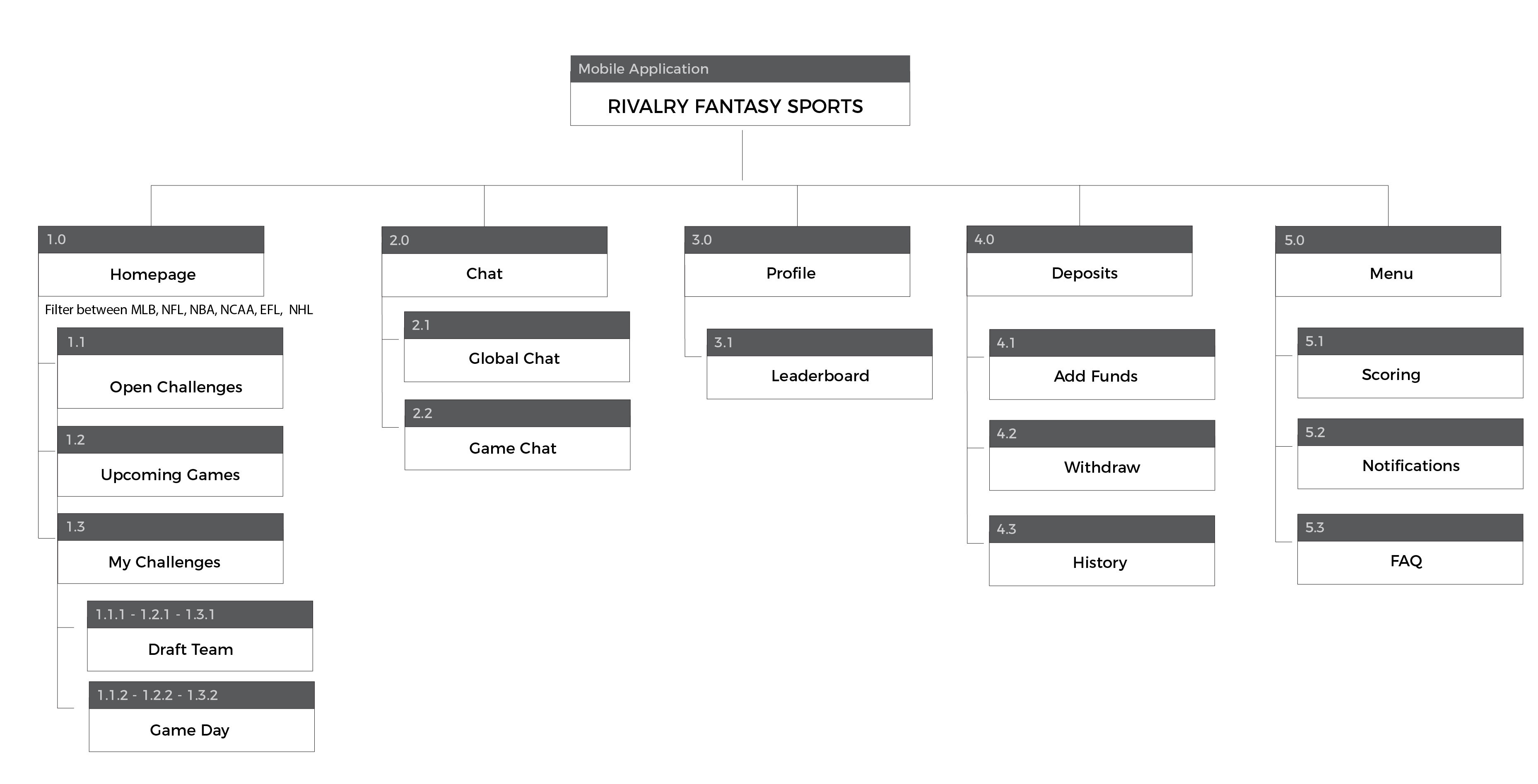
The goal of the site map for Rivalry Sports was to account for switching between linear and non-linear routes through the app.

Planning and Initial Wireframes
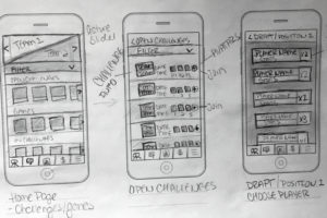
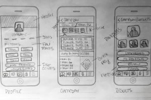
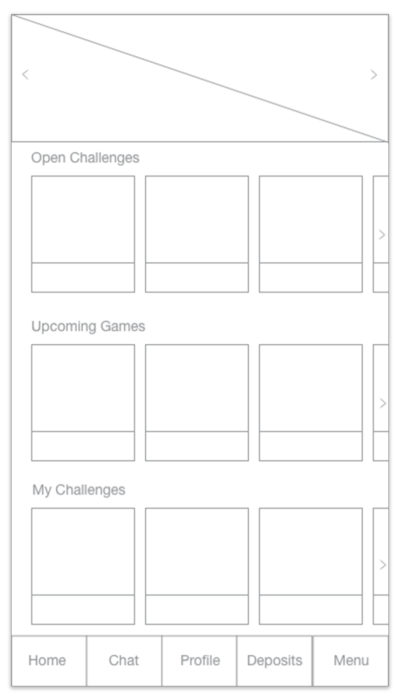
Meant to feel similar to the You42 Core platform, initial wireframes consisted of an adaptation of the You42 platform homepage. These wireframes reflect using content cards to make finding games and open challenges as simple as possible and getting users right into the drafting and gameday process.

Refinement and Med-Fi Wireframes
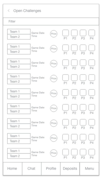
Further refinement centered around on the simplification of existing fantasy sports apps. We tried to answer questions like what is the minimum amount of necessary information about each challenge, and how can this be formatted for users to decide at-a-glance what challenges they want to enter?
Hi-fi wireframes and look/feel
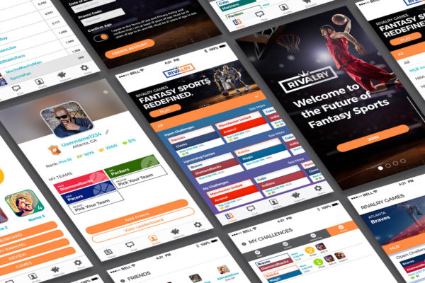
When it came to developing the look and feel for Rivalry Sports, the key was balance between the current visual system for the You42 core platform and the general expected look and feel for other fantasy sports apps.

