
The music streaming application market is one that is extremely saturated. There are many products out there doing a great job. What we really wanted to analyze for each of these products was how they were handling music discovery and promoting the artists that were currently on the platform.
Competitive Analysis


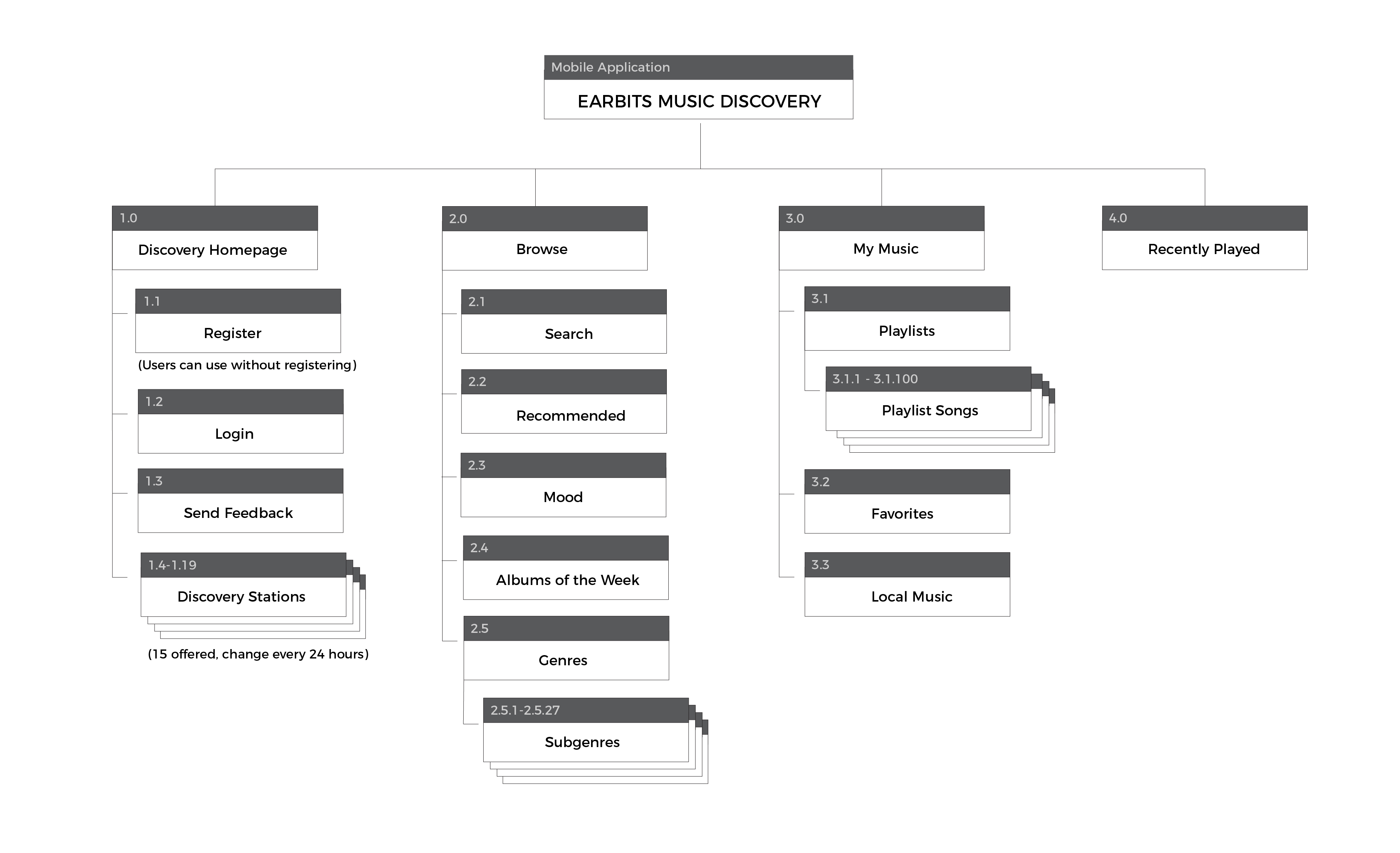
The Earbits Experience
The goal of the user experience is to place all of the emphasis on Music Discovery. Therefore the user journey is more focused around empowering the user to find a station that reflects the kind of music that the user wants to discover. Therefore the user journey reflects a deep dive into genres, moods, and activities.
Planning and Initial Wireframes
Initial wireframes reflect that the emphasis of the app is on music discovery and the expert curation done by Earbits. Users would be pushed on the homepage to choose from 1 of 15 discovery stations available each day. Size variations in the station cards allows Earbits to place emphasis on more prominent stations that each user is more likely to enjoy. Main goal is to constantly highlight music discovery rather than users looking up specific artists to listen to.


Refinement and Med-Fi Wireframes
Further refinement came in the med-fi wireframes. We constantly focused on details that would allow us to push users into music discovery, the strongest feature of Earbits.


Hi-fi wireframes and look/feel
The visual look and feel for Earbits was then refined. The goal while creating the visuals for Earbits was to coordinate with main platform of You42 and the You42 brand while still creating an experience that was uniquely Earbits.
Outcomes
After implementation of the updates to the Earbits mobile app, we saw multiple weeks featured on the Google Play store and an increase in user retention of over 50%